

Component: Toast Message
The Toast component is a brief, auto-expiring notification used to provide real-time feedback about system events or user actions. It is designed to be high-visibility but low-interruption, appearing over the application content without breaking the user's current task flow.
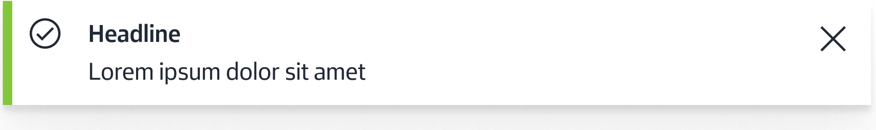
Anatomy
The toast consists of the following elements:
- Custom Message: A dynamic string providing clear, concise feedback to the user.
- Timestamp: A record of the exact time the event was triggered, assisting in chronological tracking.
- Close Icon: A custom interactive element allowing the user to manually dismiss the notification.
Properties (CoDeSys)
When implementing the component, the following properties are used to define its content and behavior:
| Property | Type | Description |
|---|---|---|
message |
string |
The primary text content to be displayed within the toast body. |
icon |
string |
The identifier for the visual asset used for the dismissal action. |
duration |
number |
The time (in milliseconds) before the toast auto-expires. |
Example usage:
Usage Guidelines
Message Configuration
The toast message is provided as a string. To maintain the component's non-intrusive nature, messages should be kept concise. It is recommended to avoid complex formatting within this string to ensure maximum readability at a glance.
Behavior & Persistence
- Auto-Expiry: The component follows a lifecycle defined by the
durationproperty. Once the time elapses, the toast will automatically animate out of view. By setting thedurationto, the toast will be shown indefinitely until the user dismisses it manually. - Manual Dismissal: The Close Icon provides a fallback for users to clear the notification immediately, ensuring the interface remains under the user's control.
CSS variables
The following css variables can be re-assigned to customize the appearance of the toast
--toast-bg
--toast-accent-color
--toast-border
--toast-height
--toast-width
--toast-padding
--toast-font-size
--toast-font-color
--toast-icon-color
--toast-icon-size