

Chart
Overview
A chart system is a data visualization component used to represent numerical or categorical data in graphical form. It helps users understand trends, comparisons, distributions, and relationships within datasets.
Charts are widely used in:
- dashboards and analytics tools,
- industrial monitoring systems,
- financial reporting platforms,
- and real-time data applications.
The main goal is to convert raw data into meaningful visual insights for faster decision-making.
Key Features
Core Visualization Features
- Multiple chart types (bar, line, pie, scatter, area, radar)
- Real-time and historical data support
- Multi-series data visualization
- Multi-axis support (especially Y-axis scaling)
- Interactive tooltips and hover details
Interaction Features
- Zoom and pan across data ranges
- Time-range selection (interval control)
- Data filtering and sorting
- Series toggling (show/hide datasets)
- Crosshair tracking for precise reading
Export & Reporting
- Export current view (image/PDF)
- Export full dataset (CSV/Excel/JSON)
- Snapshot generation for reports
UI Sections & Configuration
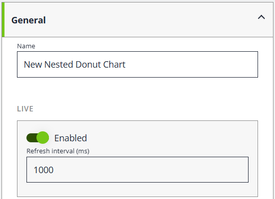
General
| Field | Description |
|---|---|
| Name | Internal name of the chart element |
| Refresh Interval (ms) | Refresh Intervals in milli seconds |
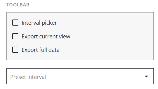
Toolbar Options
| Option | Function |
|---|---|
| Interval Picker | Allows users to select the time range displayed in the chart or data view, such as Live, Last Hour, or a Custom Range. |
| Export Current View | Exports only the data currently visible within the selected time range. |
| Export Full Data | Exports the complete dataset, regardless of the currently selected time range. |
| Toolbar Preset interval | Provides predefined time range options for quick navigation, including No Preset, Custom Range, Last 1 Minute, Last 1 Hour, Last 3 Hours, Last 6 Hours, Last 12 Hours, Last 1 Day, Last 1 Week, and Last 1 Month. |
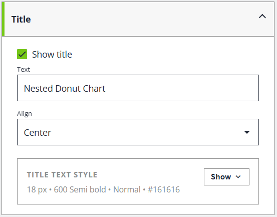
Title
| Field | Description |
|---|---|
| Show Title | Shows or hides the chart title in both the preview and the rendered chart |
| Text | Specifies the text displayed as the chart title. |
| Align | Sets the horizontal alignment of the chart title. |
| Title Text Style | Shows or hides the title text styling options. Configure typography, color, and overflow behavior for the chart title (for example: 18 px • 600 Semi Bold • Normal • #161616). |
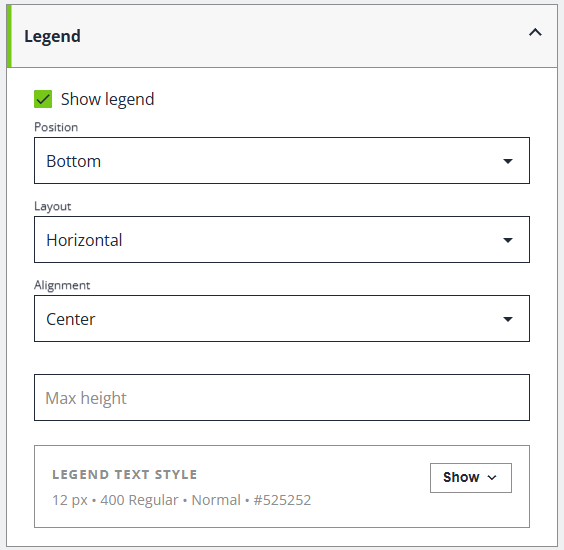
Legend
| Field | Description |
|---|---|
| Show Legend | Shows or hides the legend for this chart |
| Position | Places the legend around the chart area e.g top, right, bottom and left |
| Layout | Arranges legend items horizontally and vertically |
| Alignment | Aligns the legend within the available area |
| Max height | Sets the maximum height of the legend area before scrolling, wrapping, or truncation behavior is applied (depending on chart configuration). |
| Legend Text Styles | Shows or hides the legend text styles for this chart e.g(12 px • 400 Regular • Normal • #525252) Typography and overflow settings for legend labels. |
Layout
| Field | Description |
|---|---|
| Padding top | Inner spacing between the chart content and its container on the top side |
| Padding bottom | Inner spacing between the chart content and its container on the bottom side |
| Padding right | Inner spacing between the chart content and its container on the right side |
| Padding left | Inner spacing between the chart content and its container on the left side |
| Margin top | Outer spacing around the chart container on the top side |
| Margin bottom | Outer spacing around the chart container on the bottom side |
| Margin right | Outer spacing around the chart container on the right side |
| Margin left | Outer spacing around the chart container on the left side |
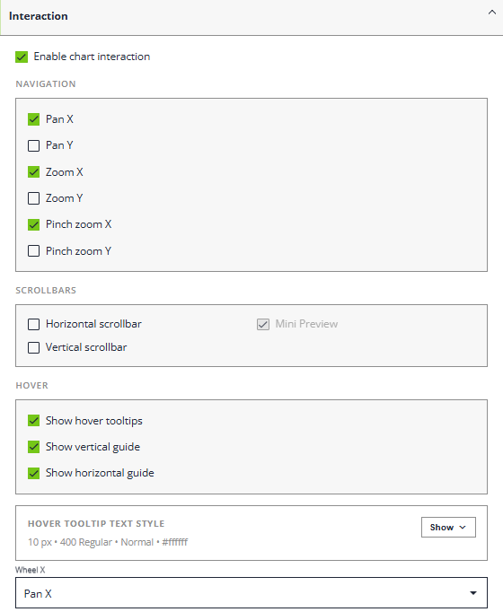
Interaction
| Field | Description |
|---|---|
| Enable Chart Interaction | Enables interactive zooming and panning for supported chart types |
| Navigation - Pan X | Allows dragging the chart horizontally |
| Pan Y | Allows dragging the chart vertically |
| Zoom X | Allows zooming along the horizontal axis |
| Zoom Y | Allows zooming along the vertical axis |
| Pinch zoom X | Allows touch pinch zooming on the horizontal axis |
| Pinch zoom Y | Allows touch pinch zooming on the vertical axis |
| Scrollbar - Horizontal scrollbar | Shows a horizontal scrollbar below the plot area for supported charts |
| Scrollbar - Vertical scrollbar | Shows a vertical scrollbar beside the plot area for supported charts |
| Scrollbar - Mini Preview | Display a mini chart preview inside the horizontal scrollbar |
| Hover - Show hover tooltips | Shows value tooltips when you hover chart points or columns |
| Hover - Show vertical guide | Shows the vertical helper guide that follows the pointer on supported XY charts |
| Hover - Show horizontal guide | Shows the horizontal helper guide that follows the pointer on supported XY charts |
| Wheel X - None, Pan X, Pan Y, Zoom X, Zoom Y | Action for horizontal wheel or tracked input. Most standard mice do not emit this. |
| Wheel Y - None, Pan X, Pan Y, Zoom X, Zoom Y | Action for the normal vertical mouse-wheel input |
Axes
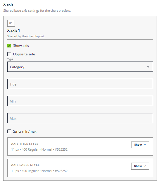
X - Axis
| Field | Description |
|---|---|
| X axis | Shared base axis settings for the chart preview. |
| X axis 1 | Shared by the chart layout. |
| Show axis | Shows or hides this axis. |
| Opposite side | Move this axis to the opposite side of the chart. |
| Type - Category, Date, Gapless Date, Duration | Scale type available for this axis in the current chart family |
| Title | Optional title shown for this axis |
| Min | Lower bound used for this axis when supported by the chart type. |
| Max | Upper bound used for this axis when supported by the chart type. |
| Strict min/max | Lock this axis to the exact min and max values instead of auto-expanding |
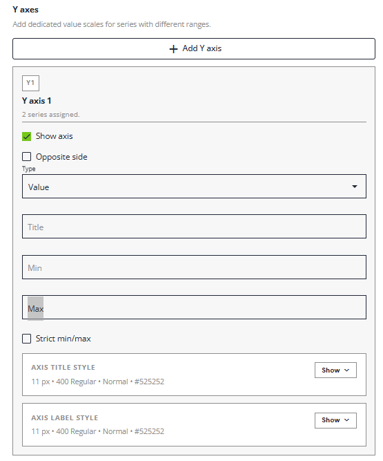
Y - Axis
| Field | Description |
|---|---|
| Y axis | Add dedicated value scales for series with different ranges. |
| Y axis 1 | 2 series assigned. |
| Show axis | Shows or hides this axis. |
| Opposite side | Move this axis to the opposite side of the chart. |
| Type - Value, Date, Gapless Date, Duration | Scale type available for this axis in the current chart family |
| Title | Optional title shown for this axis |
| Min | Lower bound used for this axis when supported by the chart type. |
| Max | Upper bound used for this axis when supported by the chart type. |
| Strict min/max | Lock this axis to the exact min and max values instead of auto-expanding |
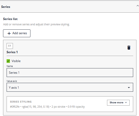
Series
| Field | Description |
|---|---|
| Series list | Add or remove series and adjust their preview stylings. |
| Visible | Shows or hide this series in the chart preview. |
| Name - Series 1 | Display name used for this series in the chart and legend. |
| Value axis - Y axis 1 | Assigns this series to one of the configured value axes. |
| Series Styling | Shows or hides the series styling into #0f62fe • rgba(15, 98, 254, 0.18) • 2 px stroke • 0.9 fill opacity. |
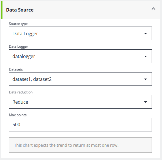
Data Source
Data source editing is currently supported for cartesian charts, pie and donut charts, radar charts, and gauges.
| Field | Description |
|---|---|
| Source type | Choose whether chart data is edited locally or loaded from a trend source. |
| Data Logger | Trend source used to populate this chart preview |
| Datasets | Datasets from the selected trend source that feed this chart |
| Data reduction | How the selected trend data is reduced before previewing or rendering the chart eg. All, Reduce, Average, Median, Quick Reduce, Local Extremes |
| Max points | Limits how many points are requested from the trend source when data reduction is applied |
Advanced JSON
Here is the full definition of the chart settings. For expert mode usage.
{
  "chart": {
    "layout": {
      "paddingTop": 4,
      "paddingRight": 4,
      "paddingBottom": 4,
      "paddingLeft": 4,
      "marginTop": 5,
      "marginRight": 5,
      "marginBottom": 5,
      "marginLeft": 5
    },
    "title": {
      "enabled": true,
      "text": "Pie Chart",
      "align": "center",
      "style": {
        "color": "#161616",
        "fillOpacity": 1,
        "opacity": 1,
        "fontFamily": "",
        "fontSize": 18,
        "fontWeight": "600",
        "fontStyle": "normal",
        "fontVariant": "normal",
        "textDecoration": "none",
        "maxWidth": null,
        "oversizedBehavior": "none",
        "breakWords": false
      }
    },
    "legend": {
      "enabled": true,
      "position": "bottom",
      "layout": "horizontal",
      "textStyle": {
        "color": "#525252",
        "fillOpacity": 1,
        "opacity": 1,
        "fontFamily": "",
        "fontSize": 12,
        "fontWeight": "400",
        "fontStyle": "normal",
        "fontVariant": "normal",
        "textDecoration": "none",
        "maxWidth": null,
        "oversizedBehavior": "none",
        "breakWords": false
      }
    },
    "interaction": {
      "enabled": false,
      "panX": false,
      "panY": false,
      "zoomX": false,
      "zoomY": false,
      "scrollbarX": false,
      "scrollbarY": false,
      "wheelX": "none",
      "wheelY": "none",
      "pinchZoomX": false,
      "pinchZoomY": false
    },
    "axes": {
      "x": [],
      "y": []
    },
    "series": []
  },
  "definition": {
    "kind": "placeholder",
    "title": "Simple Pie Chart",
    "message": "Add at least one row with numeric values for the pie chart."
  }
}
It shows the results as below
{
"chart": {
"layout": {
"paddingTop": 4,
"paddingRight": 4,
"paddingBottom": 4,
"paddingLeft": 4,
"marginTop": 5,
"marginRight": 5,
"marginBottom": 5,
"marginLeft": 5
},
"title": {
"enabled": true,
"text": "Pie Chart",
"align": "center",
"style": {
"color": "#161616",
"fillOpacity": 1,
"opacity": 1,
"fontFamily": "",
"fontSize": 18,
"fontWeight": "600",
"fontStyle": "normal",
"fontVariant": "normal",
"textDecoration": "none",
"maxWidth": null,
"oversizedBehavior": "none",
"breakWords": false
}
},
"legend": {
"enabled": true,
"position": "bottom",
"layout": "horizontal",
"textStyle": {
"color": "#525252",
"fillOpacity": 1,
"opacity": 1,
"fontFamily": "",
"fontSize": 12,
"fontWeight": "400",
"fontStyle": "normal",
"fontVariant": "normal",
"textDecoration": "none",
"maxWidth": null,
"oversizedBehavior": "none",
"breakWords": false
}
},
"interaction": {
"enabled": false,
"panX": false,
"panY": false,
"zoomX": false,
"zoomY": false,
"scrollbarX": false,
"scrollbarY": false,
"wheelX": "none",
"wheelY": "none",
"pinchZoomX": false,
"pinchZoomY": false
},
"axes": {
"x": [],
"y": []
},
"series": []
},
"definition": {
"kind": "placeholder",
"title": "Simple Pie Chart",
"message": "Add at least one row with numeric values for the pie chart."
}
}