

Pages
Custom Input Stepper
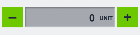
The Custom Input Stepper is an intuitive control that allows users to increment or decrement a numeric value using dedicated plus and minus buttons. It supports unit display, step size configuration, and value boundaries—making it ideal for fine-tuning operational parameters in real time.
Overview
Designed for precise value adjustments, the Custom Input Stepper enables users to safely modify parameters like temperature, brightness, or pressure. It connects to external systems (e.g., CODESYS, MQTT) via connection strings, providing instant feedback and synchronization with the underlying process or device.
Key Features
Increment/Decrement Controls
- Users adjust values using
+andâbuttons. - Prevents manual entry errors and improves usability.
Real-Time Variable Binding
- Connects to external data sources (e.g., CODESYS, MQTT).
- Sends live value updates on each step change.
Step Size Configuration
- Define custom step intervals (e.g., 0.5, 1, 5).
- Enables both coarse and fine adjustment modes.
Min/Max Value Limits
- Set minimum and maximum bounds to ensure safe operation.
- Prevents invalid or unsafe values from being set.
Unit Display
- Append unit labels (e.g., °C, bar, %) to the value for context.
- Improves clarity and reduces misinterpretation.
Compact & Visual Design
- Visually communicates value changes with simple controls.
- Easily fits into control panels or settings menus.
Use Cases
Temperature Control
- Example: Adjust a heating element’s setpoint within safe operating limits.
Lighting or Brightness Settings
- Example: Set screen or room brightness in predefined increments.
Pressure or Speed Adjustments
- Example: Fine-tune pump pressure or conveyor belt speed.
SVG ID Reference Table
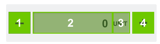
Use the following SVG IDs to assign dynamic values and manage visual elements for the Custom Input Stepper:
| # | Element | SVG ID |
|---|---|---|
| 1 | Minus Button | gButtonMinus |
| 2 | Value | dValue_value |
| 3 | Unit (optional) | dUnit_value |
| 4 | Plus Button | gButtonPlus |
Code Snippet Example
<g id="gValue">
<g id="Rectangle 4708" filter="url(#filter0_ii_337_934)">
<rect class="fallback-stepper-value-background custom-control custom-input-stepper stepper-value-background" x="87" y="25" width="319" height="72" rx="4"/>
</g>
<g id="gUnit">
<text class="fallback-stepper-value custom-control custom-input-stepper stepper-value" xml:space="preserve" style="white-space: pre" font-family="Arial" font-size="20" font-weight="bold" letter-spacing="0em"><tspan id="dUnit_value" x="350.301" y="70.9336">UNIT</tspan></text>
</g>
<g id="gValue">
<text class="fallback-stepper-unit custom-control custom-input-stepper stepper-unit" id="value_tspan" text-anchor="end"  xml:space="preserve" style="white-space: pre" font-family="Arial" font-size="36" font-weight="bold" letter-spacing="0em"><tspan id="dValue_value" x="330" y="76.4805">9</tspan></text>
</g>
</g>
<g id="gButtonPlus">
<rect class="fallback-stepper-btn-background custom-control custom-input-stepper stepper-btn-background" id="Rectangle 4710" x="413" y="25" width="72" height="72"/>
<text class="fallback-stepper-btn-color custom-control custom-input-stepper stepper-btn-color" id="+" xml:space="preserve" style="white-space: pre" font-family="Arial" font-size="50" font-weight="bold" letter-spacing="0em"><tspan x="434.4" y="79.334">+</tspan></text>
</g>
<g id="gButtonMinus">
<rect class="fallback-stepper-btn-background custom-control custom-input-stepper stepper-btn-background" id="Rectangle 4709" x="8" y="25" width="72" height="72"/>
<text  class="fallback-stepper-btn-color custom-control custom-input-stepper stepper-btn-color" id="minus" xml:space="preserve" style="white-space: pre" font-family="Arial" font-size="50" font-weight="bold" letter-spacing="0em"><tspan x="30.084" y="76.334">-</tspan></text>
</g>
</g>
<g id="gValue">
<g id="Rectangle 4708" filter="url(#filter0_ii_337_934)">
<rect class="fallback-stepper-value-background custom-control custom-input-stepper stepper-value-background" x="87" y="25" width="319" height="72" rx="4"/>
</g>
<g id="gUnit">
<text class="fallback-stepper-value custom-control custom-input-stepper stepper-value" xml:space="preserve" style="white-space: pre" font-family="Arial" font-size="20" font-weight="bold" letter-spacing="0em"><tspan id="dUnit_value" x="350.301" y="70.9336">UNIT</tspan></text>
</g>
<g id="gValue">
<text class="fallback-stepper-unit custom-control custom-input-stepper stepper-unit" id="value_tspan" text-anchor="end" xml:space="preserve" style="white-space: pre" font-family="Arial" font-size="36" font-weight="bold" letter-spacing="0em"><tspan id="dValue_value" x="330" y="76.4805">9</tspan></text>
</g>
</g>
<g id="gButtonPlus">
<rect class="fallback-stepper-btn-background custom-control custom-input-stepper stepper-btn-background" id="Rectangle 4710" x="413" y="25" width="72" height="72"/>
<text class="fallback-stepper-btn-color custom-control custom-input-stepper stepper-btn-color" id="+" xml:space="preserve" style="white-space: pre" font-family="Arial" font-size="50" font-weight="bold" letter-spacing="0em"><tspan x="434.4" y="79.334">+</tspan></text>
</g>
<g id="gButtonMinus">
<rect class="fallback-stepper-btn-background custom-control custom-input-stepper stepper-btn-background" id="Rectangle 4709" x="8" y="25" width="72" height="72"/>
<text class="fallback-stepper-btn-color custom-control custom-input-stepper stepper-btn-color" id="minus" xml:space="preserve" style="white-space: pre" font-family="Arial" font-size="50" font-weight="bold" letter-spacing="0em"><tspan x="30.084" y="76.334">-</tspan></text>
</g>
</g>
gButtonPlus
dUnit_value
dValue_value
gButtonMinus
â
+