

Pages
Custom Bargraph
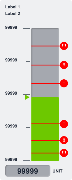
The Custom Bargraph control is a powerful and configurable widget designed to visualize real-time data as a horizontal or vertical bargraph. It offers extensive customization options, making it ideal for monitoring analog values such as temperature, pressure, or fill levels.
Overview
This control not only displays a continuously updating bargraph tied to a variable, but also allows for the presentation of numeric values, units, labels, and alarm thresholds—enabling quick and intuitive interpretation of system states.
Key Features
Dynamic Data Display
- Connect to a real-time data variable (e.g., from CODESYS or MQTT).
- The bar height/length reflects the live value.
Numerical Value & Unit
- Optionally display the current value numerically alongside the bar.
- Add a unit suffix (e.g., °C, %, bar) for context.
Custom Labels
- Add up to two labels (e.g., "Input Pressure", "Max Safe").
- Use them to describe or categorize the visualized value.
Intermediate Markers
- Display up to 5 intermediate values as reference markers on the bar.
- Useful for denoting ranges, such as “Optimal”, “Critical”, or “Warning”.
Alarm Thresholds
- Define up to 6 alarm limits.
- Each limit can visually indicate when the value enters a critical range, allowing operators to respond quickly to anomalies.
Configurable Appearance
- Adjust colors, bar direction (horizontal or vertical), and styling to match your interface.
Use Cases
Process Monitoring
- Example: Show tank fill levels or pump pressure with visual thresholds for overfill or underpressure warnings.
Environmental Metrics
- Example: Display temperature or humidity with clearly marked safe and danger zones.
Production Lines
- Example: Monitor speed, load, or material count and show warning states if a process exceeds defined limits.
SVG ID Reference Table
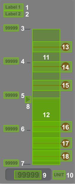
Use the following SVG IDs to correctly assign dynamic values to elements within the Custom Bargraph:
| # | Element | SVG ID |
|---|---|---|
| 1 | Label Line 1 | label_1_tspan |
| 2 | Label Line 2 | label_2_tspan |
| 3 | Intermediate Value 5 | tick_major_5_value |
| 4 | Intermediate Value 4 | tick_major_4_value |
| 5 | Intermediate Value 3 | tick_major_3_value |
| 6 | Intermediate Value 2 | tick_major_2_value |
| 7 | Intermediate Value 1 | tick_major_1_value |
| 8 | Thumb (Current Value Indicator) | thumb |
| 9 | Main Value | value_tspan |
| 10 | Unit | label_unit_tspan |
| 11 | Bargraph Range | barPath |
| 12 | Bargraph Fill | barFill |
| 13 | Limit 1 | limit_hi_3 |
| 14 | Limit 2 | limit_hi_2 |
| 15 | Limit 3 | limit_hi_1 |
| 16 | Limit 4 | limit_lo_1 |
| 17 | Limit 3 | limit_lo_2 |
| 18 | Limit 3 | limit_lo_3 |
| 19 | Bargraph Icon | barIcon |
| 12 | Root Class | custom_control_root |
DATA JSON Interface
{
    "value": "20",
    "label1": "Custom Bar label 1",
    "label2": "Custom Bar label 2",
    "unit": "",
    "ticks": [
        "0",
        "10",
        "20",
        "50",
        "100"
    ],
    "parameters": {
        "pMin": -20,
        "pMax": 200,
        "pLimitHi1": {
            "enabled": true,
            "value": 150
        },
        "pLimitHi2": {
            "enabled": true,
            "value": 170
        },
        "pLimitHi3": {
            "enabled": true,
            "value": 190
        },
        "pLimitLo1": {
            "enabled": true,
            "value": 20
        },
        "pLimitLo2": {
            "enabled": true,
            "value": -10
        },
        "pLimitLo3": {
            "enabled": true,
            "value": -15
        }
    },
    "theme": {
        "barBorder": "",
        "barPath": "",
        "barLFill": "",
        "barRFill": "",
        "thumb": ""
    },
    "general": {
        "rootClass": ""
    }
}
Advanced: Custom Bargraph Icons
Bargraphs can display different icons to represent various states or trends. For instance, arrow icons can be used to indicate whether a value is increasing or decreasing.
Bargraph Icon CoDeSys Setup
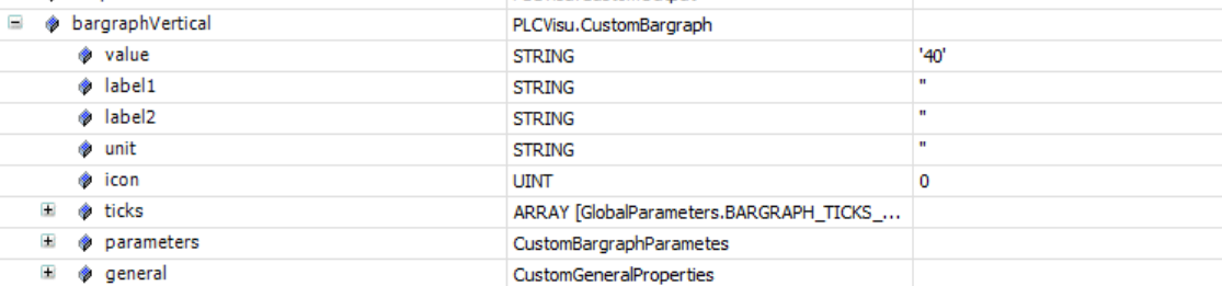
In this example, the Icon property is set to 0, meaning no icon is displayed. To show an icon, change the value of the Icon property to 1 or 2. These values allow you to switch between two predefined icon states, enabling dynamic visual feedback within the bargraph. The icons themselves are defined in the corresponding svg element.