

Pages
Custom Switch
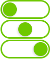
The Custom Switch control is a versatile widget that allows users to toggle between three distinct states. It is ideal for controlling systems or devices that require a middle state, such as selecting between low, medium, and high settings or enabling multiple system modes.

Overview
The Custom Switch enables users to cycle through three predefined states, providing more flexibility than a typical toggle. Each state is visually represented, ensuring users can quickly identify and switch between them.
Key Features
Three-State Switch
- Toggle between three states (e.g., Low, Medium, High, or Off, Standby, On).
- Each state is clearly indicated with distinct colors, icons, or labels.
Real-Time State Reflection
- The switch immediately reflects the current state, giving users visual feedback for better interaction.
Configurable Appearance
- Adjust the switch’s appearance, including colors, size, and style, to match the system’s theme or design.
State Change Feedback
- Provide visual, auditory, or haptic feedback when switching between states to improve the user experience.
Use Cases
System Modes
- Example: Switch between different modes of a device, such as Low, Medium, and High power settings.
Multi-Level Controls
- Example: Control intensity levels in systems like lighting, air conditioning, or heating with three distinct settings.
Device Management
- Example: Cycle through three operational states of a machine, such as Off, Standby, and On.
SVG ID Reference Table
| # | Element | SVG ID |
|---|---|---|
| 1 | State 1 | gState_1 |
| 2 | State 2 | gState_2 |
| 3 | State 3 | gState_3 |
| 4 | Thumb | thumb |
Code Snippet Example
<g id="gState_1">
<rect class="fallback-switch-background custom-control custom-switch custom-switch-background" id="Rectangle 1" x="2.5" y="1.5" width="97" height="35" rx="17.5" stroke-width="3"/>
<g id="thumb">
<g  class="fallback-switch-thumb custom-control custom-switch custom-switch-thumb" id="circle" filter="url(#filter0_d_323_297)">
<circle cx="20" cy="19" r="15"/>
<circle cx="20" cy="19" r="14.5" stroke="url(#paint0_linear_323_297)"/>
</g>
</g>
</g>
<g id="gState_2">
<rect class="fallback-switch-background custom-control custom-switch custom-switch-background" id="Rectangle 1_2" x="2.5" y="1.5" width="97" height="35" rx="17.5"  stroke-width="3"/>
<g  class="fallback-switch-thumb custom-control custom-switch custom-switch-thumb" id="thumb_2">
<g id="circle_2" filter="url(#filter1_d_323_297)">
<circle cx="51" cy="19" r="15" />
<circle cx="51" cy="19" r="14.5" stroke="url(#paint1_linear_323_297)"/>
</g>
</g>
</g>
<g id="gState_3">
<rect  class="fallback-switch-background custom-control custom-switch custom-switch-background" id="Rectangle 1_3" x="2.5" y="1.5" width="97" height="35" rx="17.5"  stroke-width="3"/>
<g class="fallback-switch-thumb custom-control custom-switch custom-switch-thumb" id="thumb_3">
<g id="circle_3" filter="url(#filter2_d_323_297)">
<circle cx="82" cy="19" r="15" />
<circle cx="82" cy="19" r="14.5" stroke="url(#paint2_linear_323_297)"/>
</g>
</g>
</g>
<g id="gState_1">
<rect class="fallback-switch-background custom-control custom-switch custom-switch-background" id="Rectangle 1" x="2.5" y="1.5" width="97" height="35" rx="17.5" stroke-width="3"/>
<g id="thumb">
<g class="fallback-switch-thumb custom-control custom-switch custom-switch-thumb" id="circle" filter="url(#filter0_d_323_297)">
<circle cx="20" cy="19" r="15"/>
<circle cx="20" cy="19" r="14.5" stroke="url(#paint0_linear_323_297)"/>
</g>
</g>
</g>
<g id="gState_2">
<rect class="fallback-switch-background custom-control custom-switch custom-switch-background" id="Rectangle 1_2" x="2.5" y="1.5" width="97" height="35" rx="17.5" stroke-width="3"/>
<g class="fallback-switch-thumb custom-control custom-switch custom-switch-thumb" id="thumb_2">
<g id="circle_2" filter="url(#filter1_d_323_297)">
<circle cx="51" cy="19" r="15" />
<circle cx="51" cy="19" r="14.5" stroke="url(#paint1_linear_323_297)"/>
</g>
</g>
</g>
<g id="gState_3">
<rect class="fallback-switch-background custom-control custom-switch custom-switch-background" id="Rectangle 1_3" x="2.5" y="1.5" width="97" height="35" rx="17.5" stroke-width="3"/>
<g class="fallback-switch-thumb custom-control custom-switch custom-switch-thumb" id="thumb_3">
<g id="circle_3" filter="url(#filter2_d_323_297)">
<circle cx="82" cy="19" r="15" />
<circle cx="82" cy="19" r="14.5" stroke="url(#paint2_linear_323_297)"/>
</g>
</g>
</g>
thumb
gState_3
gState_2
gState_1
# **Custom Switch**
The **Custom Switch** control is a versatile widget that allows users to toggle between three distinct states. It is ideal for controlling systems or devices that require a middle state, such as selecting between low, medium, and high settings or enabling multiple system modes.


## **Overview**
The **Custom Switch** enables users to cycle through three predefined states, providing more flexibility than a typical toggle. Each state is visually represented, ensuring users can quickly identify and switch between them.
## **Key Features**
### **Three-State Switch**
- Toggle between **three** states (e.g., Low, Medium, High, or Off, Standby, On).
- Each state is clearly indicated with distinct colors, icons, or labels.
### **Real-Time State Reflection**
- The switch immediately reflects the current state, giving users visual feedback for better interaction.
### **Configurable Appearance**
- Adjust the switch’s appearance, including colors, size, and style, to match the system’s theme or design.
### **State Change Feedback**
- Provide visual, auditory, or haptic feedback when switching between states to improve the user experience.
## **Use Cases**
### **System Modes**
- Example: Switch between different modes of a device, such as Low, Medium, and High power settings.
### **Multi-Level Controls**
- Example: Control intensity levels in systems like lighting, air conditioning, or heating with three distinct settings.
### **Device Management**
- Example: Cycle through three operational states of a machine, such as Off, Standby, and On.
## **SVG ID Reference Table**

| **#** | **Element** | **SVG ID** |
|------:|-----------------------------------|--------------------------|
| 1 | State 1 | `gState1` |
| 2 | State 2 | `gState2` |
| 3 | State 3 | `gState3` |
| 4 | Thumb | `thumb` |
## **Code Snippet Example**
```