

Pages
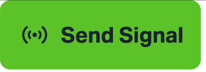
State Push Element
Overview
The State Push element is an interactive control used to send a continuous signal to a target system (e.g., CODESYS) while the element is actively pressed by the user.
It behaves similarly to a momentary push button, where the signal is only active during the press action and stops immediately upon release.
Behavior
-
On Press:
When the user presses the State Push element, a signal is continuously transmitted to the connected variable or endpoint. -
While Held:
The signal remains active for the entire duration of the press. -
On Release:
The signal is immediately stopped once the user releases the button.
Key Characteristics
- Momentary interaction (non-latching)
- Real-time signal transmission
- Immediate response to user input
- Designed for continuous control actions
Use Cases
Typical scenarios where the State Push element is useful include:
- Jog controls (e.g., moving a motor while pressed)
- Manual overrides
- Triggering temporary actions
- Sending sustained boolean signals (
TRUEwhile pressed,FALSEon release)
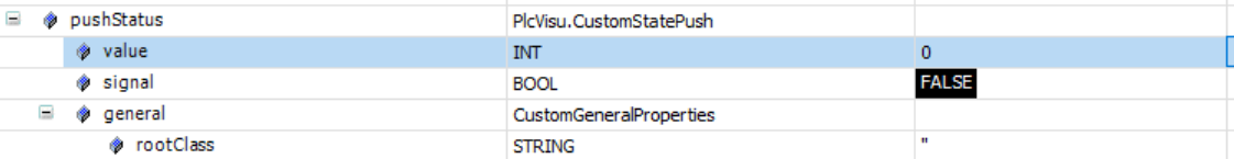
Integration with CODESYS
Visualising UI State
The visual appearance of the State Push control is defined by how the SVG is structured.
Each UI state is placed inside a group with a specific ID:
gState_X
You can assign states to these groups freely. For example:
| SVG Group | UI State |
|---|---|
| gState_0 | Default State |
| gState_1 | Active State (only visible while the user is pressing the button) |
| gState_2 | Disabled State |
How it works
The value in CODESYS must match the index of the SVG group.
- If the variable is
0→gState_0is shown (default) - If the variable is
2→gState_2is shown (disabled)
Note:
The active/pressed state (gState_1) is only rendered while the user is physically pressing the button.
Setting the value to 1 alone is not enough to display this state.
Sending the Signal
| UI State | CODESYS Bool Variable Value |
|---|---|
| Pressed | TRUE |
| Released | FALSE |