

Controls
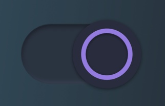
Toggle
A toggle is a button with two states. When the user clicks the button, the state changes. Examples of toggling can be found in the following figures.

CS3
Binding type: BOOLEAN
When a user clicks on the button, a new state is set via the connection channel to the PLC.
SVG Element
id = "labelOff"
- An element (preferably a group) that should be visible when the value of the bound variable is false must have the ID "LabelOff".
id = "labelOn"
- Conversely, the element that should be visible when the value is true must have the ID "labelOn".
Examples of CSS Styling
It demonstrates how to use .css to implement the color palettes (e.g., Light / Dark modes) and control an SVG element with `id="labelOn" and id="labelOff" .
If you add to the PlcVisu CSS Editor for the following line:
.theme-light #labelOn{
        fill: red;
}
.theme-light #labelOff{
        fill: black;
}
.theme-dark #labelOn{
        fill: blue;
}
.theme-dark #labelOff{
        fill: white;
}
You can control this SVG file, e.g. over the id "#labelOn" setting the color.
And you can this regarding light mode -->Text is red
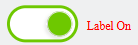
or dark mode -->Text is blue

Conclusion
The SVG drawing of the switcher can contain any graphics. The principle is that the elements nested under the group "labelOff" are displayed if the value of the bound variable is false, and elements under the group "labelOn" are displayed if the value is true.