

Pages
自定义开关(Custom Switch)
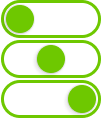
Custom Switch(自定义开关) 是一个功能多样的控件,允许用户在三个不同的状态之间切换。
它非常适合用于需要中间状态的系统控制,例如:选择低/中/高档,或在多个系统模式之间切换。

概述
Custom Switch 控件支持在三个预设状态间循环切换,提供比传统开关更多的交互灵活性。每个状态都有清晰的视觉指示,用户可以快速识别并切换状态。
主要特性
三状态切换
- 可在 三个状态 间切换(如:低 / 中 / 高 或 关闭 / 待机 / 开启)
- 每个状态通过不同的颜色、图标或标签来区分
实时状态反馈
- 当前状态即时显示,提供明确的视觉反馈
可配置外观
- 可调整颜色、大小和样式,以匹配系统主题或界面设计
状态切换反馈
- 状态切换时可配置视觉、音效或触觉反馈,提升用户体验
典型应用场景
系统模式切换
- 示例:在低功率、中功率和高功率模式之间切换设备运行模式
多级控制
- 示例:控制照明、空调或加热系统的三个不同强度级别
设备状态管理
- 示例:循环切换机器的三个运行状态:关闭、待机和开启
SVG ID 参考表
| # | 元素说明 | SVG ID |
|---|---|---|
| 1 | 状态 1(State 1) | gState_1 |
| 2 | 状态 2(State 2) | gState_2 |
| 3 | 状态 3(State 3) | gState_3 |
| 4 | 滑块(Thumb) | thumb |
示例代码片段
<g id="gState_1">
<rect class="fallback-switch-background custom-control custom-switch custom-switch-background" id="Rectangle 1" x="2.5" y="1.5" width="97" height="35" rx="17.5" stroke-width="3"/>
<g id="thumb">
<g  class="fallback-switch-thumb custom-control custom-switch custom-switch-thumb" id="circle" filter="url(#filter0_d_323_297)">
<circle cx="20" cy="19" r="15"/>
<circle cx="20" cy="19" r="14.5" stroke="url(#paint0_linear_323_297)"/>
</g>
</g>
</g>
<g id="gState_2">
<rect class="fallback-switch-background custom-control custom-switch custom-switch-background" id="Rectangle 1_2" x="2.5" y="1.5" width="97" height="35" rx="17.5"  stroke-width="3"/>
<g  class="fallback-switch-thumb custom-control custom-switch custom-switch-thumb" id="thumb_2">
<g id="circle_2" filter="url(#filter1_d_323_297)">
<circle cx="51" cy="19" r="15" />
<circle cx="51" cy="19" r="14.5" stroke="url(#paint1_linear_323_297)"/>
</g>
</g>
</g>
<g id="gState_3">
<rect  class="fallback-switch-background custom-control custom-switch custom-switch-background" id="Rectangle 1_3" x="2.5" y="1.5" width="97" height="35" rx="17.5"  stroke-width="3"/>
<g class="fallback-switch-thumb custom-control custom-switch custom-switch-thumb" id="thumb_3">
<g id="circle_3" filter="url(#filter2_d_323_297)">
<circle cx="82" cy="19" r="15" />
<circle cx="82" cy="19" r="14.5" stroke="url(#paint2_linear_323_297)"/>
</g>
</g>
</g>
<g id="gState_1">
<rect class="fallback-switch-background custom-control custom-switch custom-switch-background" id="Rectangle 1" x="2.5" y="1.5" width="97" height="35" rx="17.5" stroke-width="3"/>
<g id="thumb">
<g class="fallback-switch-thumb custom-control custom-switch custom-switch-thumb" id="circle" filter="url(#filter0_d_323_297)">
<circle cx="20" cy="19" r="15"/>
<circle cx="20" cy="19" r="14.5" stroke="url(#paint0_linear_323_297)"/>
</g>
</g>
</g>
<g id="gState_2">
<rect class="fallback-switch-background custom-control custom-switch custom-switch-background" id="Rectangle 1_2" x="2.5" y="1.5" width="97" height="35" rx="17.5" stroke-width="3"/>
<g class="fallback-switch-thumb custom-control custom-switch custom-switch-thumb" id="thumb_2">
<g id="circle_2" filter="url(#filter1_d_323_297)">
<circle cx="51" cy="19" r="15" />
<circle cx="51" cy="19" r="14.5" stroke="url(#paint1_linear_323_297)"/>
</g>
</g>
</g>
<g id="gState_3">
<rect class="fallback-switch-background custom-control custom-switch custom-switch-background" id="Rectangle 1_3" x="2.5" y="1.5" width="97" height="35" rx="17.5" stroke-width="3"/>
<g class="fallback-switch-thumb custom-control custom-switch custom-switch-thumb" id="thumb_3">
<g id="circle_3" filter="url(#filter2_d_323_297)">
<circle cx="82" cy="19" r="15" />
<circle cx="82" cy="19" r="14.5" stroke="url(#paint2_linear_323_297)"/>
</g>
</g>
</g>
thumb
gState_3
gState_2
gState_1
# **Custom Switch**
The **Custom Switch** control is a versatile widget that allows users to toggle between three distinct states. It is ideal for controlling systems or devices that require a middle state, such as selecting between low, medium, and high settings or enabling multiple system modes.


## **Overview**
The **Custom Switch** enables users to cycle through three predefined states, providing more flexibility than a typical toggle. Each state is visually represented, ensuring users can quickly identify and switch between them.
## **Key Features**
### **Three-State Switch**
- Toggle between **three** states (e.g., Low, Medium, High, or Off, Standby, On).
- Each state is clearly indicated with distinct colors, icons, or labels.
### **Real-Time State Reflection**
- The switch immediately reflects the current state, giving users visual feedback for better interaction.
### **Configurable Appearance**
- Adjust the switch’s appearance, including colors, size, and style, to match the system’s theme or design.
### **State Change Feedback**
- Provide visual, auditory, or haptic feedback when switching between states to improve the user experience.
## **Use Cases**
### **System Modes**
- Example: Switch between different modes of a device, such as Low, Medium, and High power settings.
### **Multi-Level Controls**
- Example: Control intensity levels in systems like lighting, air conditioning, or heating with three distinct settings.
### **Device Management**
- Example: Cycle through three operational states of a machine, such as Off, Standby, and On.
## **SVG ID Reference Table**

| **#** | **Element** | **SVG ID** |
|------:|-----------------------------------|--------------------------|
| 1 | State 1 | `gState1` |
| 2 | State 2 | `gState2` |
| 3 | State 3 | `gState3` |
| 4 | Thumb | `thumb` |
## **Code Snippet Example**
```